
Beauty Is Not Unprofessional, Actually
A practical LadyBoss eyewear piece with style notes, real-life frame advice, and the kind of clarity that still cares about the mirror.
Beige Neutrality Watch
Femininity keeps getting treated like an extra, which is odd for something people notice immediately. A practical object on the face does not get a free pass to be ugly.
That is the real issue in the beauty-and-usefulness argument: frames have to help, flatter, and still feel like something we meant to wear. Not in a motivational-poster way. In a very real mirror, purse, dashboard, office-light way.
Softness is not a surrender
A weak frame makes the beauty-and-usefulness argument feel bigger than it is. A better one keeps the whole thing from becoming a production. The wrong pair can turn a small task into a whole mood, and we have enough moods scheduled already.
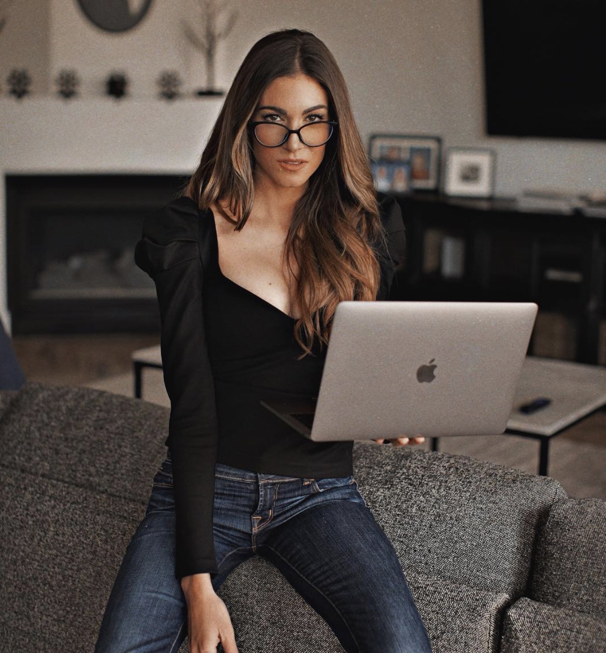
Frames can be useful without watering down the beauty. The details are ordinary and visible: color, lift, softness, structure, comfort, and whether the face still looks like ours. Femininity does not need to become beige to be taken seriously.
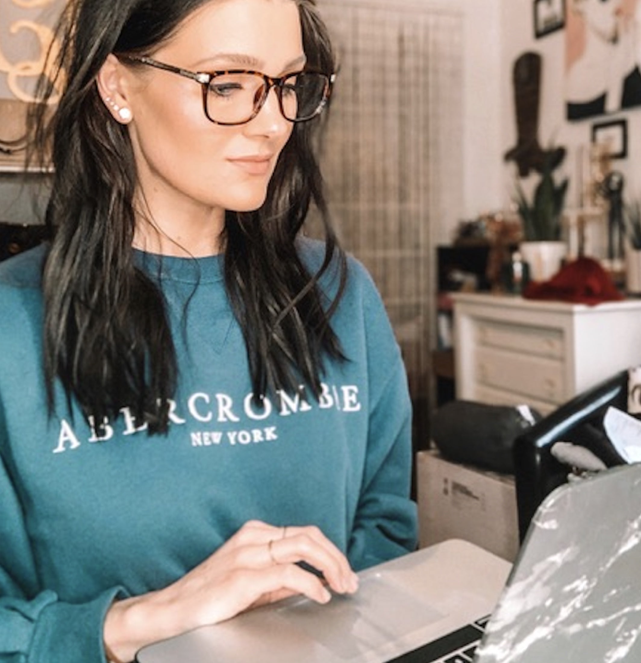
The first check is fit. Frames should sit where they belong instead of sliding down the nose right when the beauty-and-usefulness argument needs us to act composed. The difference is small on a product page and obvious in a mirror.
The frame can keep the room honest
The good version is not trying to be invisible. It is trying to be easy to live with. That means the bridge sits right, the temples behave, and the lenses do not turn the whole look into an errand.
The practical checklist is not glamorous until it saves the look: lens choice, fit, comfort, shape, and the color sitting closest to the eyes. The result is calmer, sharper, and a lot less emotionally expensive.
Color matters too. Black can sharpen the mood; tortoise can warm it up; leopard can make the whole thing braver; crystal clear can keep it clean and modern. The goal is not a different personality. The goal is a better version of the same face in the beauty-and-usefulness argument.
What we do not need is the kind of eyewear that solves the practical issue while making the face look like it lost a negotiation. The better choice makes beauty-and-usefulness argument feel less like a trial and more like a normal part of getting dressed. It is calm, but not dull.
The pretty part has a job
We are not accepting eyewear that solves one problem and creates three new mirror problems. The right pair does not need a defense speech. It just looks right fast.
In practice, that means choosing frames we can actually keep on: during the errand, the call, the label check, the mirror pause, the second look. The whole face relaxes when the detail stops fighting the rest of the look.
A shopper does not need a thesis here. She needs to know whether the frame helps her read, work, drive, pack, sit at the table, or look alive in questionable light. That is the relief hiding underneath the style.
The final check is practical, which is secretly where style gets honest. Can frames stay comfortable, useful, and pretty when the day stops being theoretical? A good frame makes the practical part less noisy and the pretty part less fragile.
We can like the drama of the beauty-and-usefulness argument without letting the glasses become dramatic themselves. The advice should sound like something a friend with taste would say before the second photo is even taken.
The practical recommendation is to choose frames the way we choose the visible parts of an outfit: by how they behave once the day starts moving. A frame that needs constant adjustment has already started a side plot. The stronger choice is the one that works when the outfit is simple, the light is rude, and the day is already asking for patience.
The best version does not circle the same worry three times. It looks at the beauty-and-usefulness argument, makes the call, and moves. That is how the mirror gets a useful answer instead of another negotiation.
That is why the little mirror yes matters more than a long explanation. The beauty-and-usefulness argument will not wait for better lighting, better timing, or a more convenient mood. So the choice has to be ready for real light, real movement, real faces, and the ordinary chaos around us.
Tiny object, very public placement. That is why the face gets the final vote.
The verdict
Beauty is not unprofessional, actually does not need more filler, more theory, or more glasses pretending function is enough. Choose the frame that makes the practical choice feel like taste.
That is the standard.


Leave a comment
This site is protected by hCaptcha and the hCaptcha Privacy Policy and Terms of Service apply.