
The Feminine Advantage Is Not Decorative
This is the softer-sharper side of women’s eyewear: useful frames, feminine taste, real confidence, and no apology for caring how it looks.
Beige Neutrality Watch
A practical object on the face does not get a free pass to be ugly. There is always someone trying to make beauty sound optional.
That is the real issue in the beauty-and-usefulness argument: frames have to help, flatter, and still feel like something we meant to wear. Not because anyone needs more pressure. Because the detail is visible, and visible things affect the mood.
We are not shrinking the beautiful part
This is where the joke turns into a real mirror problem: lighting, timing, witnesses, and a frame sitting right on the face. The face should not have to work around the tool that was supposed to help it.
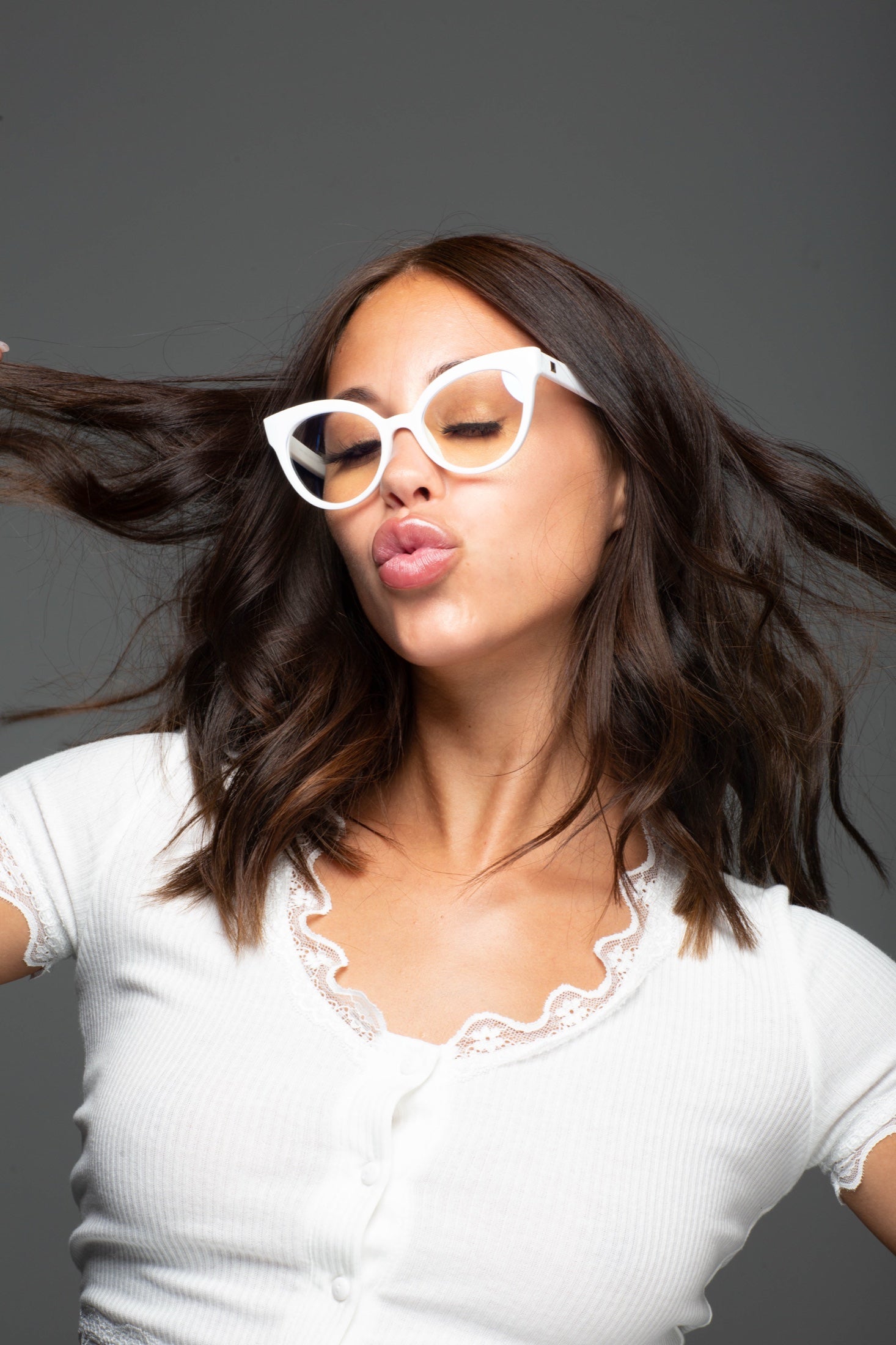
Frames can be useful without watering down the beauty. The details are ordinary and visible: color, lift, softness, structure, comfort, and whether the face still looks like ours. Femininity does not need to become beige to be taken seriously.
The first check is comfort. Frames should not punish the bridge of the nose, grab the hair, or make the beauty-and-usefulness argument feel like a timed exam. A good frame earns trust quietly, which is very chic of it.
Practical still answers to the mirror
The better answer is not louder eyewear. It is eyewear with a clear job and a prettier finish. That means the style has enough polish for real clothes and enough sense for real life.
The frame can be pretty, but it still has to behave. That means no sliding, no pinching, no strange glare, and no making the face look borrowed. Once those pieces are right, the style part stops feeling like extra credit.
The lens matters too. Reader strength, clear blue-light help, prescription clarity, or sun coverage changes how frames behave in the real room. This is how the beauty-and-usefulness argument becomes easier: fewer apologies, fewer adjustments, and fewer bad mirror negotiations.
What we do not need is a pair that only works in a perfect mirror with perfect hair and no plans after 2 p. m. The better choice keeps beauty-and-usefulness argument from taking over the whole mood. It is pretty, but not precious.
The face keeps its vote
The point is not perfection. The point is refusing the lazy little tradeoff between help and style. Useful can be pretty. Pretty can have a job. Everybody can calm down.
It also means noticing where this actually happens: not in perfect studio light, but in the messy middle of the day. The best version feels useful first, then quietly glamorous after.
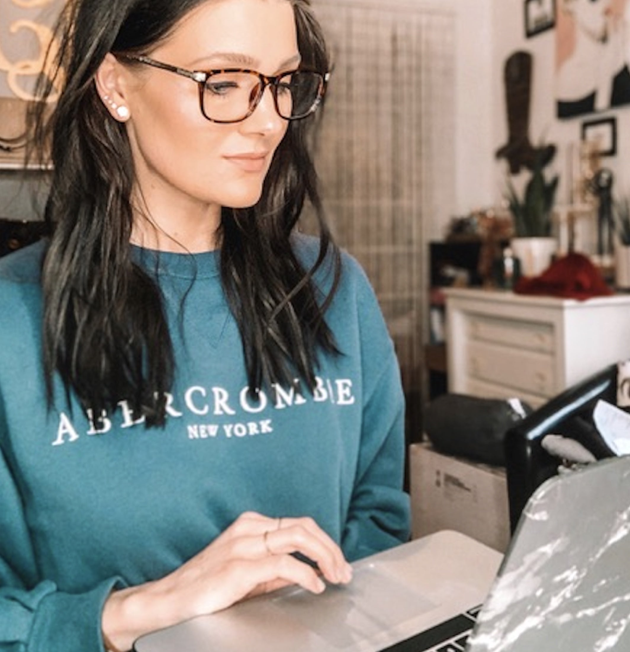
A real woman does not wear frames in theory. She wears them while answering messages, checking labels, fixing lipstick, hauling a bag, or trying to look normal in the beauty-and-usefulness argument. The pretty part is stronger when the practical part is handled.
The final check is not dramatic. Put on frames, look at the face, and see whether the beauty-and-usefulness argument starts making more sense. That is not overthinking. That is refusing to let a visible detail become the weak link.
We can be funny about the beauty-and-usefulness argument and still be serious about fit, lens choice, and how the frame changes the face. The standard can stay sharp while the vague little compromises leave quietly through the side door.
The practical recommendation is to stop treating frames like a hidden tool when they are sitting exactly where eye contact happens. A frame that makes the face look tired is not saving anyone time. The stronger choice is the one we reach for again because it solved the problem without making itself the problem.
The cleaner version still has attitude. It just stops making the face pay for a lazy frame. That is how the joke stays sharp instead of padded.
That is why the final answer has to be simple enough to use in a hurry. The beauty-and-usefulness argument is already there, usually with no warning and absolutely no sympathy for weak eyewear. So the pair has to bring comfort and taste at the same time, because splitting those jobs is how drawers fill with regrets.
Quiet detail, loud difference. That is the whole tension in the beauty-and-usefulness argument.
The verdict
The feminine advantage is not decorative is small until it is sitting on the face all day. Choose the glasses that can survive real light and still look like us.
That is where the mirror can finally stop arguing.


Leave a comment
This site is protected by hCaptcha and the hCaptcha Privacy Policy and Terms of Service apply.